1. Poor or outdated visual design
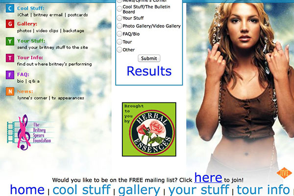
Nothing makes a customer say “no thanks” as quickly as a really gruesome home page. It could be horrendous colour choices or a naff logo. Or it could just be that things have aged badly. We sympathise a lot with businesses here because quality websites cost money; but things move quickly in the digital era. Sites that looked slicker than a brand-new Ferrari a few years ago now look like a third-hand Volvo.
State of the art… in 1997 (sorry Exmouth View Hotel, we’re sure you are so much greater than your website!) The simple answer is to refresh or start again. Yes, it costs money, but how much income might you be losing due to a duff website?
2. Slow upload speed
There is little more annoying than waiting forever for something to load (anyone remember the ZX Spectrum? You could make a cup of tea and come back before one of the games loaded). Worse, Google will actually penalise you in the rankings for this! Large image files are the most common cause, and the remedy can be simple: cut your file sizes down! File-crunching aids like tinyjpeg.com are extremely handy here. Or invest in a CMS system that automatically resizes images.
3. Clutter
This is a common trap for so many businesses. You might have started with a simple main message and a couple of tidy banners; three years later you have a dozen different windows all wrestling for space and attention. This can be a headache for the user and could easily detract from your main message.
The solution here is to sort your priorities. Your home page needn’t try and squeeze in every last thing you do. Smart, simple, logic always wins the day. Unless you are the infamous Ling’s Cars (below), whose chaotic site has not only become the stuff of legend, but a key sales tool! To get away with this sort of chaos though, it goes without saying that you need excellent customer service and a great reputation.
4. Lack of quality images
While huge files are bad news, the same could also be said for poor pictures. Seeing as that opening image is the first impression the viewer will get, why settle for mediocre? Again, rather than thinking “how much will it cost to get quality pictures?” ask yourself “how much will it cost me if I don’t have quality pictures?” A good photographer is worth every penny.
5. Poor or confusing user journey
Talking of clutter and confusion, another common issue with websites is a lack of clear signposting. Ask yourself a simple question: how easy is it for someone to get where you want them to go? If it takes more than two clicks for the customer to be able to buy or book, your conversion rate could well be suffering.
How can you solve this? Well, the obvious way is to get others to test it. At Clockwork we do this meticulously, taking every detail into account, testing different strategies and monitoring bounce rates and other factors. A bit OTT? Not at all- there is a definite science to making more sales conversions online!


